![]()
![]()
![]()
- ASC Proceedings of the 40th Annual Conference
- Brigham Young University - Provo, Utah
- April 8 - 10, 2004
|
|
|
Construction Student Perceptions towards the Use of Presentation Software
The perceptions of college students taking courses in Construction Engineering and Management about the advantages and drawbacks of courses where instructors use computer-based presentations for lecturing have not been documented. This article presents and discusses the results of a survey that addressed this issue, along with several general instructional topics related to lecturing efficiency. These student perceptions are of crucial importance for instructors for avoiding course delivery pitfalls and emphasizing the issues and methods that students consider most important for their learning.
Key Words: Multimedia, educational software, educational practice.
Introduction
Presentation software is often advertised as an effective resource for improving the quality of a course delivery. Lectures can be structured so that all points in a topic are presented orderly and in their entirety. Furthermore, they can be revised with minimum effort, and can include pictures, video clips and other multimedia components. Numerous sources discuss the educational merits of presentation software and multimedia in general (e.g., Jackson, 1990; Marsh et al., 1999; Tucker, 2001).
Many instructors serving in Construction programs are quite proficient in the use of presentation software and other multimedia tools. But, are these instructors viewed by students as better than other instructors using only traditional lecturing tools such as overhead transparencies? Developing a computer-based presentation nowadays is much simpler than it was five or ten years ago, but is it worth the effort? Are these presentations appreciated by students? Do students feel that using PowerPoint or similar software enhance their learning? Moreover, what are the most crucial content delivery issues in a high-quality course? Instructors using presentation software could benefit greatly from a roadmap optimizing their development efforts.
This article originated from a dilemma faced by its author while preparing the courses he taught at Purdue University while serving as a Visiting Professor, and deciding whether to develop new computer-based presentations or just making traditional overhead transparencies. The author, as any other Construction instructor, could not really ponder the pros and cons of either choice, because no data existed about their merits and drawbacks as perceived by students. Relatively little research has addressed the learning of construction students from their perspective (a notable exception being Stein and Gotts study, 2001). As a result, construction educators frequently make decisions on extrapolations from studies made for students whose interests and learning preferences may differ from those in construction programs.
Objectives
This article presents and discusses the results of a survey administered to students in regular courses of the Construction Engineering and Management program at Purdue University. The main objective sought by this survey was assessing student perceptions about the advantages and drawbacks of courses where instructors mainly used presentation software to deliver their lectures, as compared to traditional transparencies shown on overhead projectors. The secondary objective of this survey was exploring issues related to course content delivery such as using guest speakers, the importance of group projects, and the effect of dimmed lights on the ability to concentrate.
The next section discusses the potential limitations inherent to this study. The most intriguing potential source of error comes from the lack of previous research about the attitudes, preferences and other personality traits of construction students. While other error sources may be nearly impossible to control, the framing error for this and future studies could be reduced with a better understanding of the construction student.
Questionnaire design considerations
Surveys can be inaccurate by design, when a preconceived result is (unethically) intended by its developer. Often, though, inaccuracies arise from poor planning or intrinsic limitations of the study. Virtually every text on social research includes some discussion on survey design; an excellent introductory source is the book by Salant and Dillman (1994). A detailed discussion of survey questionnaire design is beyond the scope of this article. However, the effect on this survey of the four main survey error sources is addressed below.
Questionnaire layout
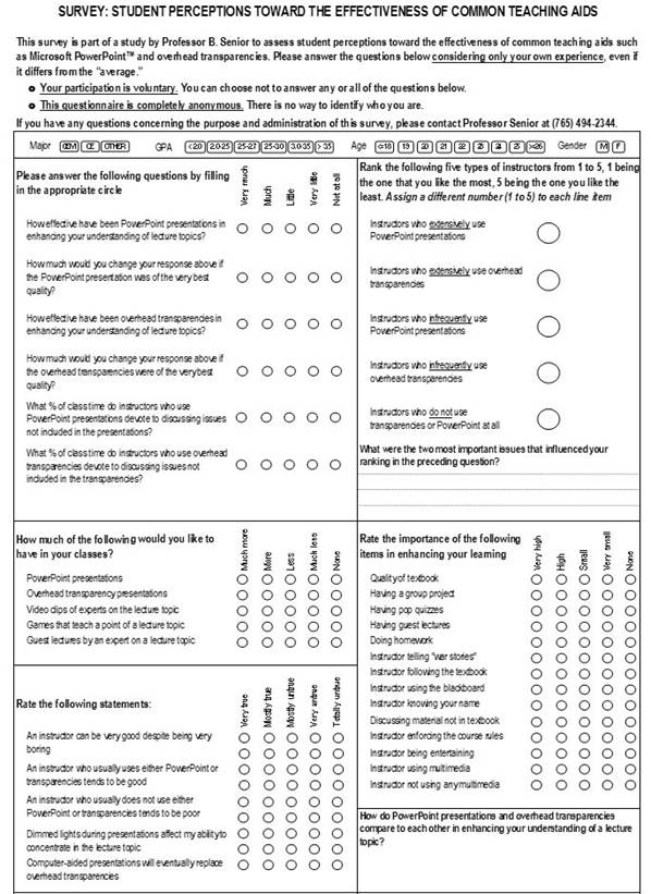
The objectives of this survey were operationalized into 42 questions. The entire questionnaire fit into one page, as shown in Appendix A. A preliminary section at the top contained instructions, a statement about the voluntary nature of participation, and a brief explanation about its objectives and sponsor. These statements provided the basic components of Informed Consent so important in current research involving human subjects, as recommended by Wiggins (1998). Questions were presented in six boxes, each addressing a roughly congruent set of issues: General information about the respondent; perceived effectiveness of presentation software versus overhead lecturing; desired amount of multimedia and traditional elements in lectures; perceived validity of statements about course delivery; ranking of instructors using computer-based presentations versus those not using it; and perceived importance of various course components.
The term presentation software was initially used to avoid referencing any specific product. Initial respondents were confused by this term and it was changed to PowerPoint, which is best-known software package with the intended capabilities. No endorsement of this product was intended, and the questionnaire instructions specified that questions referred to all computer-based teaching aids such as PowerPoint.
Of a total of 42 questions, 40 were closed-ended with ordered choices, and two were open-ended. Questions within each box had the same response choices. For example, all questions in the box addressing perceived effectiveness of multimedia-versus-overhead lecturing had choices varying from Very Much to Not at All, while the choices for all questions about the importance of course components ranged from Very High to None. The exceptions to this format were the questions about general respondent information, which were more specific by their nature (e.g., gender choices were M, F, Not disclosed), and the section on instructor ranking. This latter section proved to be confusing to respondents, yielding inconsistent results. Consequently, responses to this question are not included in the analyses below.
Sample characteristics
One hundred and one questionnaires were completed by students majoring in Construction Engineering or in Civil Engineering with a Construction concentration. These two groups were available to the author as a sample of opportunity, and do not signify any preference compared to other Construction Management programs. The CEM program at Purdue University is an ASC member, and accredited by ABET.
A breakdown of respondent characteristics is shown on Table 1.
|
Table 1: Respondent Profile
|
|||
|
Variable |
Choices |
Frequency |
Valid Percent |
|
GPA
|
<= 2.99 |
50 |
52.6 |
|
>= 3.00 |
45 |
47.4 |
|
|
Age
|
<= 20 |
30 |
30.6 |
|
21-22 |
49 |
50.0 |
|
|
>= 23 |
19 |
19.4 |
|
|
Gender
|
Not disclosed |
5 |
5.0 |
|
Female |
16 |
15.8 |
|
|
Male |
80 |
79.2 |
|
|
Major
|
CEM |
38 |
38.8 |
|
CE |
55 |
56.1 |
|
|
Other |
5 |
5.1 |
|
Analysis of Responses: Methodology
Each question set is analyzed separately. The statistics shown on their respective tables are related, but each one addresses a slightly different aspect to consider when analyzing responses. Response choices have been reduced to two opposing alternatives to highlight their trends. For simplicity, the acronym PPT is used instead of the full name PowerPoint.
Each table shows the following statistics:
All statistical analyses were conducted using SPSS™ version 12.0.
Question set: Perceived effectiveness of PPT v. traditional overhead transparencies
|
Table 2: Perceived effectiveness of multimedia v. traditional overhead transparencies
|
|||||||
|
LEGEND (Applies to all tables): |
Valid occurrences |
Percentage
|
Mean |
Standard Deviation
|
Student’s |
||
|
>= Much |
<= Little |
>= Much |
<= Little |
||||
|
OH effectiveness for understanding |
50 |
51 |
49.5 |
50.5 |
0.50 |
0.502 |
-0.10 |
|
PPT effectiveness for understanding |
68 |
31 |
68.7 |
31.3 |
0.69 |
0.466 |
3.99 |
|
Time by OH instructors to other issues |
51 |
49 |
51.0 |
49.0 |
0.51 |
0.502 |
0.20 |
|
Time by PPT instructors to other issues |
20 |
79 |
20.2 |
79.8 |
0.20 |
0.404 |
-7.35 |
Table 2 shows that while students are evenly divided about how they perceive the effectiveness of overhead transparencies (49.5% / 50.5%), they have a positive view of the instructional effectiveness of PPT (68.7% / 31.3%). On the other hand, while the perceived time spent by instructors covering other issues is also almost evenly divided for instructors using overhead transparencies, responses show a strong perception that instructors lecturing with PPT spend little time covering additional topics. Since students feel that instructors using PPT do not cover additional topics, and yet PPT is perceived as more effective than overhead transparencies, then some intriguing possibilities arise. If it is assumed that including issues that supplement the basic topic in a lecture is welcome by students, then it appears that students do not blame PPT for the little time devoted to this aspect by instructors using this tool. A second possibility is that students do not value the additional material that they perceive is more often covered by instructors using traditional overhead transparencies. Related questions, discussed here later, tend to validate this latter hypothesis.
Question set: Desired amount of class activities
|
Table 3: Desired amount of class activities
|
|||||||
|
|
Valid occurrences |
Percentage
|
Mean |
Standard Deviation
|
Student’s |
||
|
>= More |
<= Less |
>= More |
<= Less |
||||
|
Amount of guest speakers desired |
72 |
28 |
72.0 |
28.0 |
0.72 |
0.451 |
4.88 |
|
Amount of video desired |
71 |
30 |
70.3 |
29.7 |
0.70 |
0.459 |
4.44 |
|
Amount of PPT desired |
67 |
34 |
66.3 |
33.7 |
0.66 |
0.475 |
3.46 |
|
Amount of games desired |
48 |
53 |
47.5 |
52.5 |
0.48 |
0.502 |
-0.50 |
|
Amount of OH desired |
45 |
56 |
44.6 |
55.4 |
0.45 |
0.500 |
-1.10 |
Many instructors would like to include games in their classes. However, the statistics on Table 3 show that respondents were mildly against the notion of using more games in class. In fact, these numbers don’t reflect the deep antipathy felt by some students who actually went later to the author’s office to express how strongly they felt against using games in class. In their view, they are a “waste of time” and “embarrassing.” There is a possibility that such opinions reflect a bad experience for this group, instead of a sweeping disapproval of this instructional tool. This is especially likely since other questions in this cluster show a desire for real-life input (video, guest speakers). This group of questions also shows that students are ready for more PPT (66.3% in favor), and mildly wanting less use of overhead transparencies (55.4% wanting less).
Question set: Relative importance of class components
|
Table 4: Relative importance of class components
|
|||||||
|
|
Valid occurrences |
Percentage
|
Mean |
Standard Deviation
|
Student’s |
||
|
>= High |
<= Small |
>= High |
<= Small |
||||
|
Importance of entertaining instructor |
90 |
8 |
91.8 |
8.2 |
0.92 |
0.275 |
15.05 |
|
Importance of homework |
91 |
9 |
91.0 |
9.0 |
0.91 |
0.288 |
14.25 |
|
Importance of textbook quality |
87 |
13 |
87.0 |
13.0 |
0.87 |
0.338 |
10.95 |
|
Importance of using multimedia |
71 |
29 |
71.0 |
29.0 |
0.71 |
0.456 |
4.60 |
|
Importance of using blackboard |
67 |
32 |
67.7 |
32.3 |
0.68 |
0.470 |
3.74 |
|
Importance of following textbook |
67 |
33 |
67.0 |
33.0 |
0.67 |
0.473 |
3.60 |
|
Importance of war stories |
62 |
38 |
62.0 |
38.0 |
0.62 |
0.488 |
2.46 |
|
Importance of knowing your name |
58 |
42 |
58.0 |
42.0 |
0.58 |
0.496 |
1.61 |
|
Importance of guest lectures |
54 |
44 |
55.1 |
44.9 |
0.55 |
0.500 |
1.01 |
|
Importance of including extra material |
44 |
56 |
44.0 |
56.0 |
0.44 |
0.499 |
-1.20 |
|
Importance of group projects |
42 |
57 |
42.4 |
57.6 |
0.42 |
0.497 |
-1.52 |
|
Importance of enforcing course rules |
26 |
74 |
26.0 |
74.0 |
0.26 |
0.441 |
-5.44 |
|
Importance of pop quizzes |
13 |
87 |
13.0 |
87.0 |
0.13 |
0.338 |
-10.95 |
The questions shown on Table 4 for this set include a variety of topics on the area of course content delivery. These topics widen the central objective of the survey by probing what issues students perceive as most important. Questions have been sorted by their response mean, which in effect rank them by preference. While the resulting question order in Table 4 could be largely considered “logical” (showing student preferences that many instructors would find consistent with their experience), the ranking of some questions merit discussion.
Instructors being entertaining has the largest Student’s t of all questions in the survey. This would seem to point out a light attitude towards academic. However, the following preferred issues, namely homework and textbook quality, point to a serious mindset towards learning. Using multimedia follows these top three preferences, but looking at its t statistic, it belongs to a middle-of-the-road importance category, which also includes using the blackboard, following the textbook, and telling “war stories.” The next four questions in the table show preferences varying from mildly positive to mildly negative: Knowing students’ names, including guest lectures, including extra material (which is the first entry with negative t), and assigning group projects. There seems to be an inconsistency between the mild positive t for the importance of guest lectures and the much higher t shown on Table 3 for the desire for more guest speakers. These results can be congruent if taken at face value: students want more of a non-crucial element. The author had informal conversations with students that seem to validate this explanation. Moreover, the negative results for including extra material is consistent with the previous discussion on how students strongly concur in that instructors using PPT tend to not include extra material, and yet using PPT is considered effective for enhancing the understanding of the course contents.
Question set: Attitudes toward given statements
|
Table 5: Attitudes toward given statements
|
|||||||
|
|
Valid occurrences |
Percentage
|
Mean |
Standard Deviation
|
Student’s |
||
|
>= True |
>= Untrue |
>= True |
>= Untrue |
||||
|
Computers will replace OH transparencies |
79 |
18 |
81.4 |
18.6 |
0.81 |
0.391 |
7.92 |
|
Instructor using aids is usually good |
62 |
38 |
62.0 |
38.0 |
0.62 |
0.488 |
2.46 |
|
Instructor can be very good & very boring |
52 |
48 |
52.0 |
48.0 |
0.52 |
0.502 |
0.40 |
|
Dimmed lights affect my concentration |
31 |
66 |
32.0 |
68.0 |
0.32 |
0.469 |
-3.79 |
|
Instructor w/o aids is usually poor |
18 |
82 |
18.0 |
82.0 |
0.18 |
0.386 |
-8.29 |
|
Effectiveness of Overheads v GPA
|
|
>= 3.00 |
|
<= 2.99 |
|
Count |
|
30 |
|
28 |
|
26 |
|
24 |
|
22 |
|
20 |
|
18 |
|
16 |
|
<= Little |
|
>= Much |
 This
question set, whose results are presented on Table 5, has the main objective of
reinforcing the significance of some questions in previous sets. These questions
were in the form of statements that respondents assessed as variations from
True to Untrue.
This
question set, whose results are presented on Table 5, has the main objective of
reinforcing the significance of some questions in previous sets. These questions
were in the form of statements that respondents assessed as variations from
True to Untrue.
There is great consensus, as shown in the top question on Table 5, that the future lies with the use of computers for lecturing. The full statement (as shown on Appendix A) was Computer-aided presentations will eventually replace overhead transparencies. Three statements dealt with perceptions about instructors: can an instructor be very good while being very boring? Is there a perception that instructors using PPT or overhead transparencies are usually better than those who do not use them? A proportion of almost 2 to 1 (62% to 38%) considered true that instructors using such aids are usually good (welcomed news for instructors investing the time and effort to develop their aids!). However, students strongly refused to prejudice against instructors who do not use aids (good news for these instructors!). Respondents were almost evenly divided about the possibility of an instructor being simultaneously good and boring. Given the decisive endorsement to the importance of instructors being entertaining, as previously discussed, this seems as another refusal by students to backing general negative statements about instructors. The statement Dimmed lights during presentations affect my ability to concentrate in the lecture topic resulted in a 2 to 1 majority of respondents stating that it was untrue.
Conclusion
This survey found a generally positive attitude from respondents towards the use of multimedia in the classroom in general, and particularly towards using presentation software for delivering course contents. Respondents were keen enough to detect a drawback frequently present in lectures using PowerPoint and similar software packages: ad-hoc material is not easy to incorporate into a presentation, since it implies an awkward change of media, from a screen with dimmed lights to a blackboard or transparency projector. Although this survey did not investigate how frequently it is indeed true that PPT instructors prefer avoiding the inclusion of extra material, there is a definite perception that this is the case. An intriguing addition to this insight was that students do not seem to give importance to ad-hoc material. This could point to indifference towards enriching a lecture’s contents, but it could also mean that students do not like surprises or adding material that could be fair play for their test. This more positive interpretation is consistent with other responses that indicate a caring student body: for example, students clearly understood the importance of homework and a good textbook.
From this article’s audience perspective, more likely to be instructors than students, many issues analyzed here are encouraging. Students give their instructors the benefit of the doubt when associating instructor quality with multimedia; while students tend to relate multimedia with good instructors, their strong refusal to prejudice against other instructors is a great indicator that students tried to be impartial in their assessments. Several responses could be considered surprising. The mild importance given to knowing students’ names was unanticipated by the author; similarly, the importance attached to an instructor being entertaining should indicate those paying attention to this aspect that they are in the right track, and serve as an objective critique to those that do not see the significance of this issue.
Students can provide honest and useful insight into many important academic issues. This survey addressed one important academic area, namely that of course content delivery, but did not exhaust by any means the many questions that need to be discerned to get a reliable course of action for the present academic environment, changing at an ever increasing rate. The author hopes that serious research continues moving forward for everyone’s benefit.
References
Jackson, G. (1990). Evaluating learning technology: methods, strategies, and examples in higher education. Journal of Higher Education 61, 294-311.
Marsh, G., McFadden, A., and Price, B. (1999). An overview of online educational delivery applications. Online Journal of Distance Learning Administration, II (III).
Salant, P. and Dillman, D. (1994). How to conduct your own survey. New York, NY: John Wiley and Sons.
Stein, J. and Gotts, V. (2001). Analysis of selected learning preferences of construction management students. Proceedings of the 2001 ASC Conference, Denver, CO. 41-48.
Tucker, S. (2001). Distance education: better, worse, or as good as traditional education? Online Journal of Distance Learning Administration, IV (IV).
Wiggins, B. (1998). Designing Survey questions. NC: Institute for Research in Social Science.
Appendix A: Survey Questionnaire